East Sussex in Figures – Mapping function guidance
A guide to how to use the Mapping functions in East Sussex in Figures
Introduction
You can access the mapping functions available on the site in several ways.
Mapping is available in:
- Topic profiles (these are the profiles you access from the front page or from the “Data” tab on the main blue toolbar)
- Data explorer tool
- Custom area reporter tool (see additional guidance for using this tool)
- Maps in main toolbar – includes interactive and static PDF boundary maps to download.
Mapping indicators from the Topic profiles
Topic profiles are accessed from the front page of ESiF by clicking on topic names (such as “Population”), or from the “Data” tab on the main blue toolbar. Once you have selected a topic, you have the option to select a “Map” or “Area Profile” from the top of each topic page.
If you select “Map” (see 1 below) you can then choose an indicator to visualise:

Select your indicator
The map opens with the data loaded for the first indicator which appears on the list on the left-hand side. Use the “file” icons to expand or collapse the menu to help navigated the data available. See example below (2).
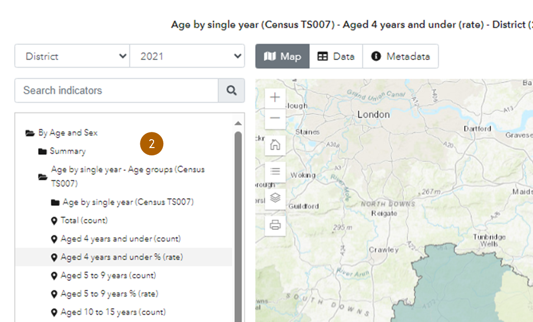
In the “Population” topic, the “By age and sex” folder contains indicators with data from the 2021 and 2011 Censuses. Data from Census 2021 will be in a folder labelled with the main census table which it comes from e.g. “(Census TS007)”. For Mid-year estimate population data, you might need to look further down the list to “mid-year estimates”. If you are unsure of the source of the data you are looking at, click on the “Metadata” tab in the map window.
Each topic has a different list of available indicators. Please ensure that you scroll through the list to ensure that you are looking at the best data to suit your needs. The most up-to-date data does not always appear at the top of the list of indicators.
Top tip! Use indicators that represent percentages or rates in a map to compare different sized areas.
Choosing/finding your geography
On the map page, the geography drop-down appears above the indicator list (3):

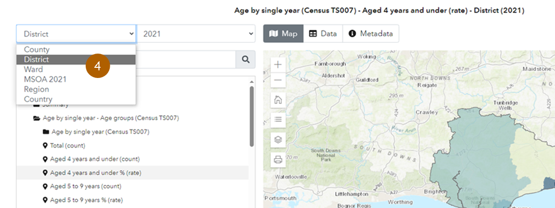
This will only show the geographical levels available for that specific indicator. For example – in this case, the indicator is “Age 4 years and under (rate)” from the 2021 Census. The geographic levels available are District, LA (County), Ward, Region and Country (4):
If we choose “Ward” for this indicator, the percentage of people aged 0 to 4 in each ward are shown on the map (5):

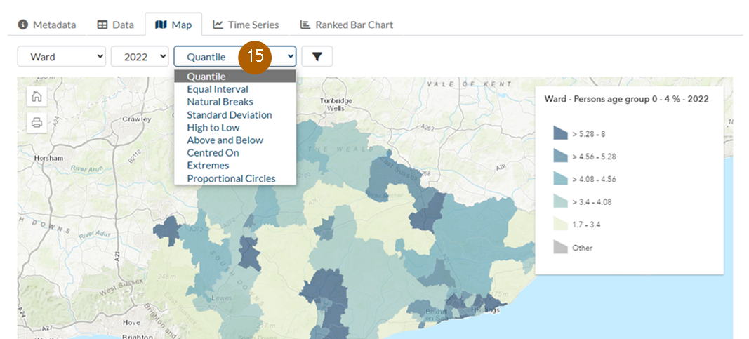
You can see the legend by clicking on the three lines (“expand”) below the “home” icon on the map. You can change the way data is displayed on the map by clicking on the drop down next to the word “Quantile” above (see 15 below).
Note that although this indicator is a 5 year age group, it is listed in the “Age by single year – Age groups (Census TS007)/Age by single year” folder. Do explore the folders if you can’t initially see what you need. You can also try using the search function.
Different indicators will be available at different geographical levels. For example, the “Sex by single year of age” data from the 2021 Census is only available for Districts and above. Ward and LSOAs data is not available. Note that this indicator is from the 2021 Census, so the year shown is 2021.
Choosing or finding the date
The drop down in the date field in the mapping lists the date the data is available for. In the case of 2021 Census data this is 2021. Other indicators will be available for a variety of dates in a time series. Note the most up-to-date data may not be the one which loads first. It is worth exploring the indicator list to find the most up to date data.
When choosing a different indicator make sure you select a date too. Your selection will default to the data in the previous selection. For example, if 2021 Census data chosen for Aged 0-4 %; if the mid-year estimates are then selected, the date will default to 2021. More up-to-date data is available for Mid-year estimates (see 6 below).

The dates available will depend on the indicator selected and the geography selected. For example, mid-year estimate indicator is available for LSOA (which means 2011 LSOA) and LSOA 2021.
LSOA (2011) data is only available for 2020, so data for this date will load (7):

Whereas if we then choose LSOA 2021, there is no 2020 data so the indicator will load with the latest available date, in this case, 2022 (8):
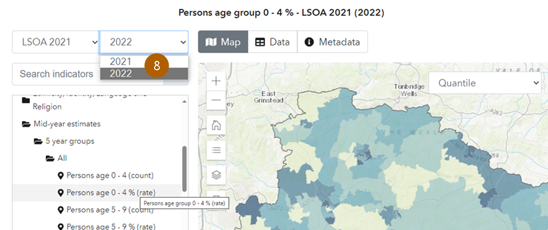
Top tip! Make sure you are looking at the most up to date data by clicking on the date dropdown.
Downloading and Metadata
Once we have mapped our data we can see and download the data in a table by clicking on the “Data” tab (9):
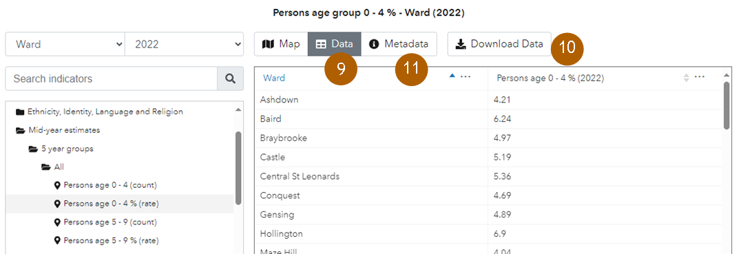
Click on “Download data” (10) and the data will download to a CSV file. Note that ward data is listed in alphabetical order.
The “Metadata” tab (11) gives detailed information about the measure. It includes the source of the data and any relevant links to the source organisation.
Mapping indicators using the Data Explorer tool
The Data Explorer tool is in the “Tools” tab. See accompanying guidance for finding the data you need from the Data Explorer tool.
To make a map from the Data Explorer, select the indicator first. The measure shown above “Persons age group 0 – 4 %” is a useful example. Enter this indicator name into the search box it will take us straight to the indicator. Ensure you use the same spacing as in the indicator name to find that specific measure.
If we select this indicator, we first see this metadata page – click on the “Map” tab (12) to access a map of the data:

Once you can see the map, you can drop down the geography menu using the “v” arrow (13). This will give you the option to select your desired geography from the list. You can also select a different year (14) (it will default to the most recent year).
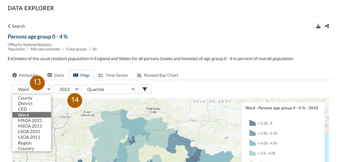
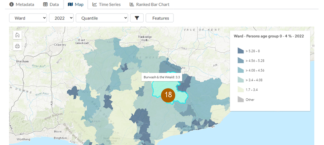
The default view is Quantile (five quintiles). The data is divided into the 5 groups, with 20% of areas in each group, but different options are available (15):
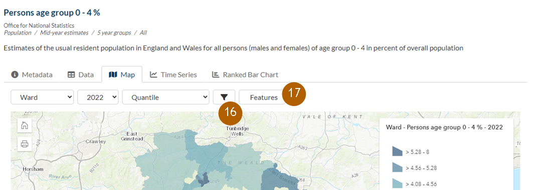
Click on the Filter icon (16). “Features” appears and if you click on this (17) you can select specific areas only to show on the map:
If you have selected specific areas, if you then click on “data” only the data you have chosen will appear.
Navigate around the map using click and drag, and use your scroll button to zoom in or out. The basemap shows a street map so you can see the specific streets covered by each area. If you hover over an area, you will see the data for that area (18).
